Hello again beautiful people! You might notice that I've been rearranging the blog layout again. I can't help myself ;) It was getting too cluttered and was loading too slowly, so some things have been given their own pages and I've cut down to one sidebar - whoo!
I've added links to connect via Twitter, RSS Feed and Facebook!
Twitter and RSS will really just update when I update the blog, but I add extra content on Facebook and have things for sale there and whatnot :)
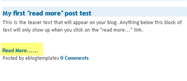
Now, I'd like your opinion please! One change I've been considering is inserting "Read More" points in my posts - some of the tutorials are pretty long! Doing this would mean that on the main page you'd just have the first bit of the post and an image to show what we're making, then if you wanted you could click "Read More" to see the whole post.
Sort of like this, but mine will be prettier of course ;) :
What do you think? Good idea? Annoying? I really can't decide, so please comment and let me know what you think!
Thanks beautiful people! Please let me know if anything is looking or behaving odd now that I've updated the blog layout so I can fix it!


9 comments:
To me the menu is all stacked to the left and I don't see text.
I think a Read More is appropriate ... would you do it for every post from now on?
OK, I think it was an Internet Explorer only issue and I *think* I've fixed it - please let me know if not! ^_^
I still haven't decided about the 'read more' links - I know it's supposed to be more secure, but pages/blogs that give you 2 sentences and make you click if you want to read more always make me do the opposite. Even if I'm really interested, it pisses me off enough that I don't bother. So I guess it all depends on where you put it? And how often?
What is that called....a text break? How do you set that up? I have seen it on other blogs....I guess it allows you to have teasers from more posts on one page, maybe???
Hello! Stopping by from the UBP! I'm looking forward to keepin up with your blog. I love being "crafty" and new ideas are awesome! Please stop by my place...i love to cook =)
www.cookinformycaptain.blogspot.com
The changes are lovely!
Very nice! I don't like the 'read more' but it might be cause I don't have the fastest computer...seems like when I'd click on that it'd take forever to load! Would it be that way in Google reader? I've been reading through posts that way to get thru them faster.
Thanks so much for all the feedback lovelies!
I think in Google Reader it only shows you up to the break point and gives you a link to follow..? I'm not sure though (hmm!)
Yeah, I thought it might keep the pages a bit shorter and tidier. I think I'd just use it for tutorials, so put an intro/summary and a photo before the break, and if people are interested they can follow the link to see the full tute.
BUT in saying that, I usually feel/behave just like SewHappyGeek said and I don't often click through myself! But I think I would for a tute I was interested in.. Maybe.. LOL!
Not sure yet, thanks for the thoughts so far! <3
Interesting to read your comments. I typically don't like the "read more", but was considering doing it on my page. (for the readers) but if they don't like it, then maybe not.
nice blog!
gail
Post a Comment
I love getting comments, they make my day! Please let me know what you think or any ideas you have for me, I would love to hear them!
Before you comment - are you a 'no-reply' blogger? If you are, I can't email a reply to your comment! I really would love to be able to! If you want to change this, go to your dashboard, click "Edit Profile", tick "show my email address" and save!
I'd really love to be able to email you back! xx